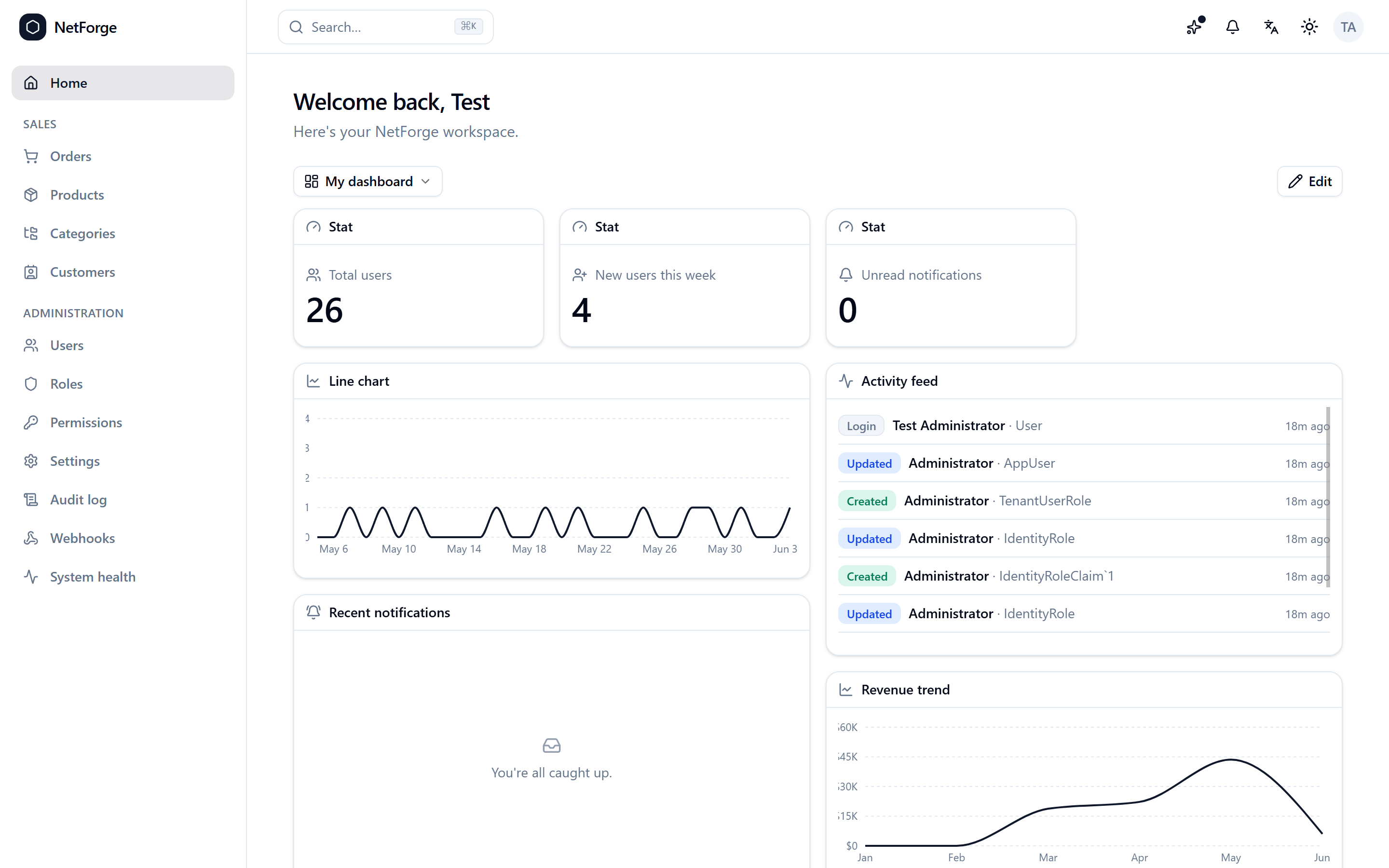
Dashboard & widgets
The home screen is a customizable widget dashboard — a responsive grid users arrange themselves and save to their account.
For users
Hit Edit to drag, resize, add, configure, and remove widgets on a responsive grid (it reflows to a single column on phones), then Save. Keep multiple named dashboards and switch between them from the dropdown — set one as default, rename, copy, or delete. The first time you visit, you get a sensible starter dashboard tailored to your permissions.
Built-in widgets
A Stat card and a bold Highlight card (a headline metric with a trend delta and a sparkline), a Goal ring (progress toward a target), a Leaderboard (ranked bars), Line / Area / Bar / Pie charts, an Activity feed (recent audit events), Recent notifications, Quick links (your own in-app shortcuts), and a Markdown note. The picker only offers widgets you have permission to populate, and every widget renders its own loading / empty / error state.
For developers
Add a widget by exporting a WidgetDefinition from src/widgets/widgets/* and registering it in src/widgets/registry.ts — it then appears in the picker:
export const RevenueWidget: WidgetDefinition = {
  type: 'revenue',
  title: 'Revenue',
  size: { w: 4, h: 2 },
  permission: 'orders.read',
  Component: RevenueChart,
};
Data widgets read from the permission-scoped /api/dashboard sources; layouts persist as DashboardLayout rows. The walkthrough is Add a dashboard widget.
Community edition
The widget dashboard is a Pro feature; Community ships a simple welcome home. See Editions.